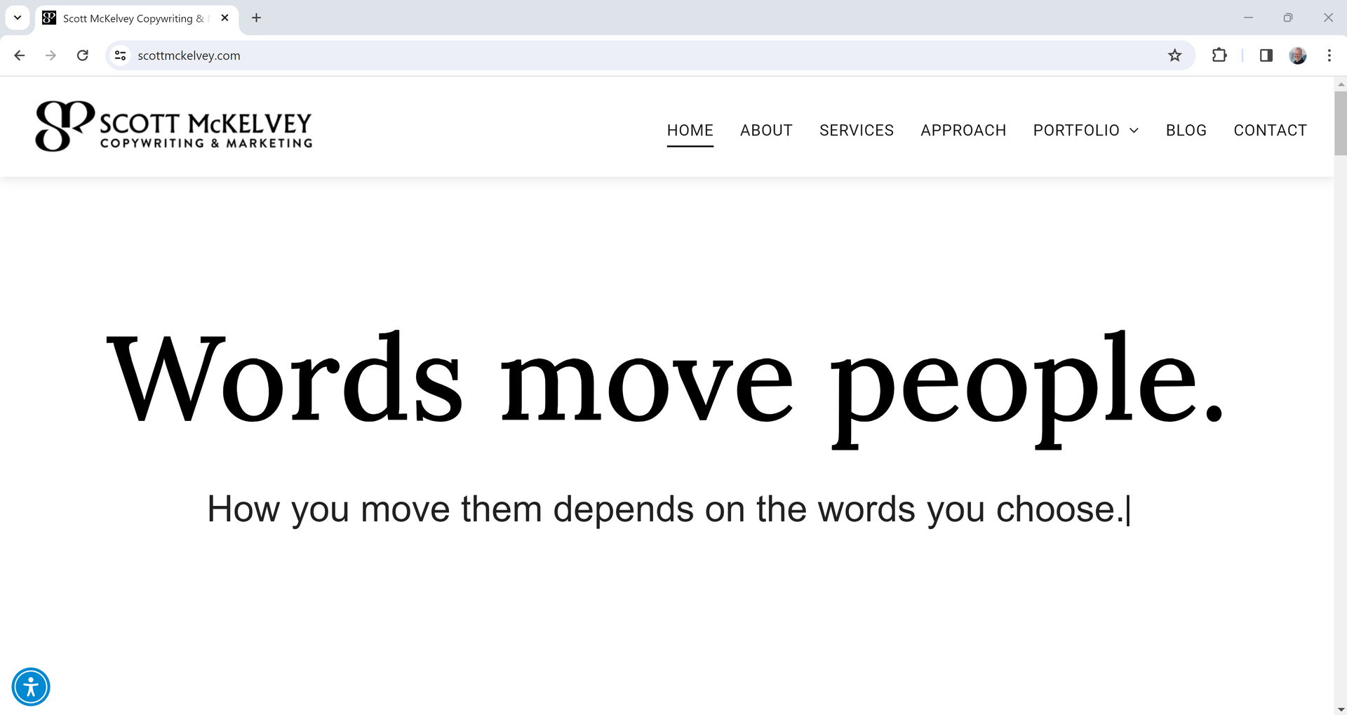
This is the website I’ve always wanted to build.

Extra-large fonts. Plenty of white space. All black and white. Design driven by typography and subtle animation.
In an age dominated by video and imagery, I made words the star of the show. I wanted to remind people that words are part of every marketing strategy.
Discount their importance at your own peril.
Although marketing typically works best when words are thoughtfully and seamlessly integrated with purposeful visuals, words alone have the power to move people.
Move people emotionally. Move people with logic and facts that justify emotional decisions. And move people to action.
I started in this direction with my last website, which I loved, but I didn’t have the vision or the stomach to take it all the way and try something totally different.
Funny thing is, I wouldn’t recommend this type of website to anyone else.
This is the website that makes sense for my business. Right now. In today’s business and marketing climate.
To be clear, I didn’t set out to create something completely unique. And it might not be. But I haven’t seen other websites like this.
The central theme is human connection. Because that’s what good marketing is capable of creating.
Strategic storytelling. Building trust and loyalty. Growth driven by relationships, not transactions. Getting people to not only believe you, but believe in you.
All in support of and alignment with clearly defined business goals.
My new website also provides a window into me as a human. My story. My voice. My approach. Why it all matters.
You’ll have a pretty good idea of what you can expect from working with me before you call, email, or fill out a form.
Not coincidentally, AI is not mentioned anywhere on my new website.
I’m not hiding from it. I’ve written blog articles about AI. I was interviewed by a CNBC reporter after posting about AI on LinkedIn. I use AI for research and brainstorming because it saves me time.
But testing various platforms has revealed a simple truth.
When it comes to writing marketing content and telling stories that create moments of human connection, AI isn’t there yet. Not even close. And AI can’t replicate the heavy lifting I do before the writing happens.
More importantly, someone who visits my website wouldn’t be there if they thought a machine could write and tell a story as well as a talented human. Or ask the kinds of questions required to develop the right message.
By the way, did you notice AI companies that originally peddled their shiny new objects promising speed and automation are now shifting their focus to the human value of AI?
Glad they’re finally coming around.
There are no shortcuts to connecting with people on a human level in an effective, meaningful way.
Other “likes”:
- My new logo mark, the only non-text element on the website. As my girls would say, it slays.
- The complete story – beginning, middle, and end – told in 19 words at the top of the Home page. 23 if you count the deleted words.
- The animation within said story that illustrates actual writing while subtly creating interest and commanding attention.
- The shift from WordPress to Duda, which will be so much easier for me to update, tweak, and test without coding or managing a bajillion plugins.
Special thank you to my colleague and friend, Eric Acevedo, at Visual Media for helping me bring my vision to life, doing all the things I don’t know how to do, and thinking of all the things that I never would consider.
So that’s the story behind my new website. I couldn’t be happier with how it looks, feels, and reads. I hope you like it, too.
And if you’re a potential client or collaborator, I hope the website captures the value I deliver and inspires you to get in touch.
Subscribe to my blog to receive insights and commentary about copywriting and marketing.
SIGN UP FOR MY BLOG
Thank you for subscribing to my blog!
Oops, there was an error sending your message. Please try again later.
I love testimonials, but only real-world, unfiltered client feedback tells the whole story.
© Scott McKelvey Consulting, LLC. All Rights Reserved. | Privacy Policy | Accessibility Statement

