Tales from my Website Update: Highlights, Lowlights, and Why I Made the Decisions I Did
I launched ScottMcKelvey.com on St. Patrick’s Day of 2006. Every new version has been released on St. Patrick’s Day.
The timing didn’t work out for version 5, so I figured halfway to St. Patrick’s Day would be the next best day to announce the latest release. Feel free to hoist a Guinness anyway.
I thought it might be helpful to provide a window into the thought process that went into my website update. Even for a site as simple as mine, with four top-level pages and blog, there are a lot of moving parts to consider in terms of content, design, and functionality.
When I went poking around through WordPress themes, I was searching, as always, for something clean and simple with lots of white space. As a writer, words are the star of my website. The challenge is to showcase the written content in a way that’s visually appealing.
I even thought about doing a completely black and white website, heavy on typography, but it felt kind of blah when I actually saw it. I decided to make the buttons green, and that little pop of color made a huge difference.
Lesson one… an idea for your website might sound good in your head but could very well flop when implemented. Don’t be afraid to test and change until you land in the right place.
Here are a few other decisions I had to make, and how I arrived at those decisions, throughout the project.
To be clear, I’m not saying my website is perfect. The purpose of this article is to help small businesses approach website updates strategically and avoid overlooking important details during the decision-making process.
What Can Be Removed?
This is the first question I always ask. What can I remove to simplify the user experience, make it easier for people to find what they need, and clarify my message?
On the previous version of my website, I had a sidebar on every page except the Home page. The sidebar included a blog sign-up form, a list of my five most recent blog articles, and a Search box.
I decided this was overkill.
As much as I want to draw more attention to my blog and get more subscribers, that’s not a priority for most people who visit my website. They want to find out if I’m the right fit for their content writing project.
On the new website, the sidebar only appears on the pages of individual blog articles.
Of course, the Search box is a valuable and popular feature that needs a home. I decided the footer would be a good place to reinsert the Search box so it would appear on every page without getting in the way.
I also simplified my Portfolio page. I used to have a clickable box for each writing category (website content, blog articles, white papers, etc.).
I decided this was unnecessary. Those boxes served no strategic purpose and didn’t make the page more visually appealing.
I decided to replace the boxes with simple text links.
Not only is this approach cleaner visually, but it’ll be easier for me to add a new category if necessary without worrying about the appearance of boxes.
Digging deeper into the Portfolio, there was room for improvement. For example, if you visited the Blog section and I had multiple blog writing samples for one client, you had to click the client’s name to get to those samples.
I decided that extra click was unnecessary.
On the new website, if you go to the Blog section, all blog samples appear on one page. I figured people would rather scroll than click, especially on mobile devices.
But Do I Need to Add Anything?
Despite my urge to remove things, sometimes information and features need to be added to provide clarity for the user. My Home page is a prime example.
The previous version of my Home page was too thin, as one of my old writing professors used to say. A headline, a short paragraph, and links to previous blog articles. Not enough meat.
I decided to beef up the Home page, but not just for the sake of beefing it up.
I added two paragraphs under the feature image that capture my value proposition on a high level. Next to that content, I added a blog sign-up form in a way that doesn’t disrupt the flow of the page.
Below that section, I added a quote about marketing and storytelling that reinforces the content above. I also added short previews and links to my About, Services, and Portfolio pages. I still have links to my three most recent blog articles near the bottom of the page.
Yes, I added stuff, but each Home page element has a strategic purpose, whether it’s intended to inform or guide the user to the next step on their journey.
Resolving My Inner Conflict about Home Page Images
I’m a content writer. Although my job involves painting pictures in the mind of the reader, writing doesn’t have an obvious visual component.
Every time I update my website, I struggle with the feature image on the Home page. What image captures what I do and the value I deliver? Do I even need an image?
The previous version of my website didn’t have a feature image on the Home page. It always bugged me a little.
But there was no way I was going to use some cheesy stock photo of a keyboard and a cup of coffee.
I always tell clients that my heavy lifting is done before any of the writing happens. If I want people to think of me as a writer and strategic partner, not a typist, why would I use an image that focuses on the typing?
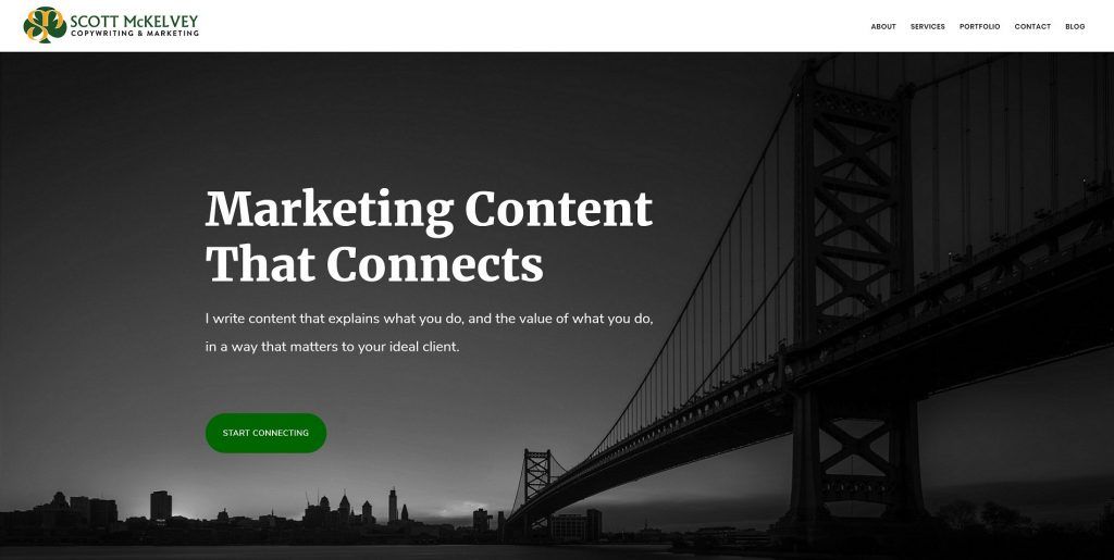
I decided to go with a metaphor.
I write content that helps brands connect with their ideal client, so I though a bridge would be an effective metaphor for building connections.
Then I started going through photos of bridges. I’m a lifelong Jersey guy, so why not choose a New Jersey bridge?
My first choice was the George Washington Bridge because the steel rope used to build it was made by Roebling Steel in Florence, where I live and work. But I couldn’t find an image that would fit the design. So I chose the Ben Franklin Bridge, which is a half hour from my office.
Will everyone understand or appreciate the local connection? Nope. But if anyone ever asks about the bridge on my website, I’ll have an interesting story to tell.
Explaining the Metaphor
I realize the bridge metaphor might not be obvious to everyone at first glance, so I mentioned the bridge in the content below the image. This reference provides clarity about the image while helping to strengthen my message and clarify my value proposition.
Win-win.
Nailing the Message
Website content has to explain the value of the products and services you offer. It has to show how you solve problem and make people’s lives better. It has to differentiate you from competitors.
My goal was to drive home several key points throughout the website:
- The role of storytelling in marketing. Not “once upon a time,” but who you are as a business and how you make people’s lives better.
- The characteristics of good content and how it can benefit your business.
- Marketing to your ideal client, not just anyone.
- My approach to content writing and how it makes me different.
While each page has a specific purpose, and website visitors have an expectation about what they’ll find on each page, there should be a cohesive message across the website.
For example, when people go to my Portfolio page, they want to see samples of my work. But that doesn’t mean the page has to be a list of samples and nothing else. Why not use this real estate to sell the value of what I do and overcome obstacles that might be going through someone’s head at this stage of their journey?
The takeaway here is that every word on every page should have a purpose and account for both your marketing goals and user expectations.
A Deep Cleaning
Every business and organization adds features, plugins, widgets, and content to their website over time. It’s easy to lose track of all this stuff as the website becomes more complex.
During the website update process, I discovered a few bad links in my portfolio. I’m usually good about catching this stuff, but I dropped the ball.
I knew my Facebook sharing link wasn’t working. When I finally investigated the issue, I learned the plugin hadn’t been updated in over a year and was no longer available for download.
I also had to get rid of that Google+ link now that the platform once dubbed by many “experts” as a Facebook killer was put out of its misery.
These are all easy fixes. But errors make you look bad if clients and prospects notice them before you do.
Don’t wait until you update your website to give it a thorough audit and deep cleaning. I recommend going through this process every few months to ensure everything is accurate, current, and functioning properly.
Speeding Things Up
A simple performance test at GTmetrix revealed that my website was slow. My website developer suggested optimizing my database and even switching hosting providers to resolve the issue.
Optimizing the database didn’t solve the performance issue, but the optimization was overdue anyway. I was open to switching hosting providers because I found my current provider’s user interface to be confusing, and making changes was always a hassle.
So I made the switch. My website’s performance improved dramatically overnight.
My old hosting provider decided to actually call me for the first time in 13 years when I cancelled the service. They said my website was hosted on an outdated server but offered to upgrade me for free.
Now I was pissed. You keep me on an outdated server for however many years and don’t tell me about it until I threaten to leave? Seriously?
The moral of the story… don’t ignore the technical side of your website, and don’t settle for poor service.
Your clients wouldn’t. Why should you?
A Big Thank You
Thank you to Bonnie Boden from Blue Denim Digital for her expertise, ideas, problem-solving ability, and patience throughout this process. I highly recommend Blue Denim Digital for website development.
All three components – expertise, ideas, problem-solving ability, and patience – are critical to a successful website update. Make sure you partner with a website development company that will tell you when you’re doing something wrong and offer recommendations for improvement instead of just saying, “Sure, whatever you want to do works for me.”
…
I could go on and on about every little decision I made and every nitpicky change I requested, but you get the idea.
Your website project demands a strategic thought process if you expect the site to be a revenue-producing marketing tool. Your ideal client demands a user experience that’s easy, seamless, and informative.
Don’t take shortcuts. The competition in the marketplace is too fierce. Give the content, design, and functionality of your website the attention they deserve. And give your ideal client the experience they demand.
Subscribe to my blog to receive insights and commentary about copywriting and marketing.

I love testimonials, but only real-world, unfiltered client feedback tells the whole story.
© Scott McKelvey Consulting, LLC. All Rights Reserved. | Privacy Policy | Accessibility Statement